The client seeks an effective solution to address low engagement and waitlist sign-ups for the upcoming launch of Curb.Health's new mobile app.
This app leverages machine learning to help users track and manage cravings, providing Just-in-Time Adaptive Interventions (JITAI) to support behavioral change during challenging moments.
The primary focus is on the end-user, with additional support for clinicians and companies, positioning the app as a valuable tool for assisting patients and employees in their journey to better health.
Crafting a seamless and user-friendly website and onboarding journey for Curb's app waitlist, thoughtfully tailored to three unique user personas. Our goal: to captivate first impressions, boost engagement, and build lasting retention from day one.
Curb.Health planned to launch their new app in October, aiming to help users manage cravings and support behavioural change. To generate interest, they introduced a waitlist on their website, but it failed to deliver the expected engagement.
Visitors struggled to understand the app's purpose and value, with unclear messaging and a confusing layout leaving many unsure about signing up. The waitlist was a critical step, intended to build a strong user base and gather insights for ongoing app development.
The app was designed to serve multiple audiences: Individuals managing cravings, clinicians using it for follow-ups and out-of-hours patient support, and companies seeking to improve employee well-being and reduce absences. The challenge was to create a website experience that clearly communicated the app's value to all audiences and encouraged sign-ups effectively.
The initial website served its purpose during the early stages of app development but struggled to effectively onboard users and promote the application. Key issues included an ineffective call-to-action with no clear purpose or user journey, as well as a lack of clarity in communicating the app's concept.
The layout hindered usability, leading to confusion among visitors. Users frequently questioned the app’s purpose and value, with basic queries like “What is the product?” and “What is it for?” left unanswered by the website content.
Additionally, recruiting participants for user research posed significant challenges. Sensitive safeguarding topics made outreach delicate, while many participants were referred by the client, raising concerns about potential bias since the pool included patients, friends, and collaborators. These factors increased the difficulties in obtaining unbiased and meaningful insights for the project.

This is the client's former website which failed to create user engagement and gather subscribers for the launching of the new coming mobile application.
We utilised the Design Thinking process, guided by the Double Diamond framework, to explore and refine solutions effectively. This approach allowed us to take a broad perspective during the Discovery phase, enabling a deep understanding of market standards and best practices, including insights from the health industry.
Following a kick-off meeting with the client, we conducted an extensive web assessment and a comprehensive competitor analysis. These steps helped identify key opportunities for improvement and optimisation. To deepen our understanding, we carried out user interviews, gathering valuable insights into user behaviour and needs under the given circumstances.
Building on these findings, we created low-fidelity wireframes to collect qualitative feedback, ensuring our process stayed user-centred. Once the wireframes were approved by stakeholders, we moved to the testing phase. Here, we conducted comparative testing between two prototypes:
Prototype A: Based on the existing website.
Prototype B: Informed by user interviews data and our competitive audit.
The testing focused on navigation, layout design, and overall intuitiveness to evaluate effectiveness among the target audience. These insights provided actionable data to guide further refinements and ensure an optimised user experience.
%201.png)
After synthesising the data, we developed a high-fidelity prototype to conduct another usability test. This allowed us to evaluate the effectiveness of new layouts designed with clear intent, assess navigation patterns, and measure user engagement. These insights guided iterations on the content hierarchy and enabled us to refine the information to boost engagement, improve call-to-action performance, and enhance overall user satisfaction.
" HMW create a confidential and adaptive experience that provides relevant and reliable information to users that suffering from cravings so they feel supported and better? "
Through meticulous user research and a comprehensive heuristic evaluation, we identified the need for a more effective and user-centric information architecture (IA). To address this, we conducted a card sorting exercise that guided the creation of an optimised and standardised prototype, delivering a seamless and informational structure for users.
Insights from our user interviews played a pivotal role in shaping the approach. For instance, we clarified distinctions between "addiction" and "cravings" to better frame the discussion around alcoholism. This ensured that the subject was addressed thoughtfully, avoiding any stigmatisation of end users.
Our research underscored the importance of restructuring the "call to action" (CTA). By redesigning its flow, we created a more engaging and informative approach to showcase the app’s features effectively.
Through comparative testing, we developed Prototype B, which featured a clear and compelling CTA. This redesign significantly improved navigation, enhanced user engagement, and ensured effective communication of the app's benefits. The result? A remarkable 95% increase in CTA interactions, demonstrating the success of our user-centred design approach.
Our usability test results revealed a highly positive user response to the new layout and information delivery. This led to a significant boost in both user engagement and satisfaction. Throughout the process, we successfully addressed all challenges presented, delivering a comprehensive solution that particularly benefited the end-user
Our goal was to design a transparent onboarding process that provides all essential information, enabling users to make informed decisions. We aimed to reassure users about the benefits of addressing their 'cravings situation' while avoiding the stigma often associated with addiction or alcoholism.

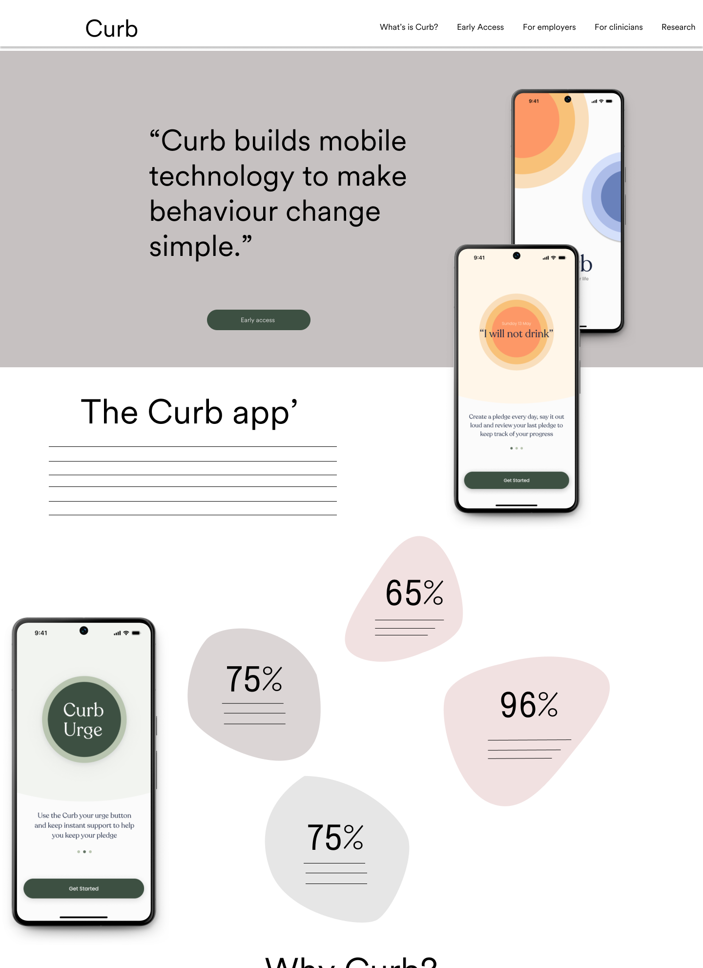
Early access page - We wanted to impact with the message and make the call to action intuitive and seamless showing glances of the App’s features plus the benefits of signing in for early access.
Increase
Call to action
Engagement
rate
Average navigation
time
Waitlist sign
ups
Curb Health has developed an innovative app to support users in managing alcohol cravings. Recognizing the sensitivity of the topic, we crafted a thoughtful research process for the app's onboarding to ensure every user feels represented, respected, and truly understood. These valuable insights guided us in designing a clear, user-friendly website that not only informs but also inspires users to confidently join the waitlist
In this project, I led communication efforts, fostered strong stakeholder relationships, and established a collaborative workflow. Initially, translating the brief into a clear design direction posed a challenge. To overcome this, we worked closely with stakeholders, guiding them through the data to ensure understanding and secure buy-in for the necessary design directions.
Working in teams taught me valuable lessons in navigating setbacks and iterating towards effective solutions. During the research phase, I discovered the crucial role of empathy in gaining insights on sensitive topics, connecting with participants on a human level. I also learned how essential it is to design a robust research strategy that aligns with both user satisfaction and core product success metrics.
In addition, I recognised the importance of tailoring research methods to engage users organically, resulting in more insightful data collection. This experience underscored the critical importance of clear communication and stakeholder engagement in UX design. It also highlighted the need for adaptability in research approaches to uncover meaningful user insights.