The client is a London-based social enterprise supporting coffee producers in poverty-stricken areas of Latin America through humanitarian education and training.
Their mission is to empower these producers and improve their livelihoods while promoting ethical coffee production.They required a website that would effectively communicate their mission, gather donations, attract investors, and highlight their impact through compelling storytelling.

Driving meaningful change in the world is no small feat. It’s not just about the mission—it’s about creating a lasting impact. To truly make a difference, a game-changing approach is essential to maximise the company's influence.
The client faced multiple challenges with their previous website:
We asked:
- What makes users donate?
- What builds trust?


To understand the needs of their audience composed by coffee lovers, socially conscious individuals, and investors, we conducted:
User Surveys: Asked target users what motivates them to donate.
Key findings:
- Transparency
- Emotional connection
- Intuitive
Stakeholder Interviews: Gained insights into the client’s long-term goals
- Increasing recurring donors
- Providing impact data to attract investors
Website Analytics Review: Examined bounce rates and session durations from the previous website to identify pain points.
1. Mission clarity: The website must effectively communicate IJC’s goal of fighting poverty in Latin America.
2. Engaging donors: Create a compelling, frictionless donation experience.
3. Brand alignment: Reinvent the brand identity to better reflect the organisation's values.

- Transparency and clear impact stories build trust.
- A seamless and mobile-friendly donation process is essential to produce call-to- action
- Visual and emotional storytelling would resonate deeply with the target audience.
- Security when donating is key for users as there are many scammers websites.
- An easy and clear access website helps all users to empathise and donate.
Thinks: “How does my donation make a difference?”
Feels: Inspired by compelling stories but frustrated with complex donation processes.
Says: “I want to know the real impact of my contribution.”
Does: Searches for organisations with transparent and trustworthy reputations.
User Journey Mapping: Highlighted touch points, from discovering the website to completing a donation, and identified friction in the process (e.g., unclear CTAs and lack of mobile optimisation.
To establish the users' needs we have gathered the following problem statements which reflect the reality in the humanitarian and social sector.
"I would like to donate but I am not sure how safe are the website's transactions"
" Making donations frustrates me a little as it is always a preset amount"
"I have issues when donating with some charities websites as they fail to produce clarity in what they do"
"As an older person some websites are so confusing for me, that I change my mind about donating"
"I don't trust websites when they do not communicate what they do, it seems like they are hiding"
Persona 1: Meredith is a designer and also a social conscious coffee lover who values transparency, storytelling and an easy way to donate.
Persona 2: Michael is an investor who likes to get involved in good causes, seeks for detailed impact when donating and appreciates informative websites.


How might we create a responsive, easy to use website that uses emotional storytelling and a seamless donation process to inspire coffee lovers and socially conscious individuals to contribute to the IJC's mission?
In our findings we found that users wanted to learn more about the project and help, while some similar websites focus more on collecting donations mainly, users felt disconnected with the NGOs' cause which make them feel purely transactional instead of be part of the change.
Increase Conversion Rate: Optimize CTAs and the donation process.
Build Brand Trust: Through impactful storytelling and transparency.
Enhance Engagement: Improve average time spent on the site and newsletter sign-ups.
Accessibility: Ensure a responsive, multilingual experience for global donors.
Pain Points:
- Lack of clear NGO ethos or mission.
- Website content does not establish credibility or showcase transparency.
- Missing real-life impact stories or testimonials.
Recommendations:
- Showcase the NGO’s vision, values, and mission prominently on the homepage.
- Use impact stories, photos, and videos to connect emotionally with users.
- Include certifications, financial audits, or awards to build trust.
Pain Points:
- The purpose of donations isn't clearly defined.
- Limited or vague explanations of programs or initiatives.
- Fear of scams or misuse of donations.
Recommendations:
- Create specific, clear donation goals
- Use a breakdown of fund allocation
- Offer a trust badge or “Verified NGO” label to assure users of authenticity.
Pain Points:
- No suggested donation amounts or flexible
- options.Uncertainty around the impact of different donation levels.
- Confusing or overly complex forms.
Recommendations:
- Display preset donation amounts with tangible impacts (e.g., “£25 feeds 10 children for a day”).
- Offer a custom donation option for flexibility.
- Simplify the donation process into 3 clear steps (amount, payment, confirmation).
Pain Points:
- Uncertainty about website responsiveness or security.
- Slow loading times or unresponsive pages.
- Payment errors or technical glitches (e.g., mobile site issues).
Recommendations:
- Optimise the website for mobile and desktop responsiveness.
- Use SSL encryption and show secure payment options
- Provide a real-time confirmation message after payment.
Pain Points:
- No immediate feedback or confirmation email.
- Lack of follow-up communication about the impact of the donation.
- Feeling disconnected from the cause after donating.
Recommendations:
- Send a thank-you email immediately after donation with details of their contribution.
- Provide updates on how their donation is making a difference (e.g., monthly newsletters).
- Offer users the opportunity to join a community of donors or receive periodic updates about ongoing projects.
- Address emotional hesitation through transparency and trust-building at every step.
- Optimize the website’s usability and simplify donation flows to reduce friction.
- Maintain an ongoing relationship with donors post-transaction to build loyalty.
After the define stage and research findings we could had a more clear approach to possible solutions, using the insights to capture the users' needs and challenges
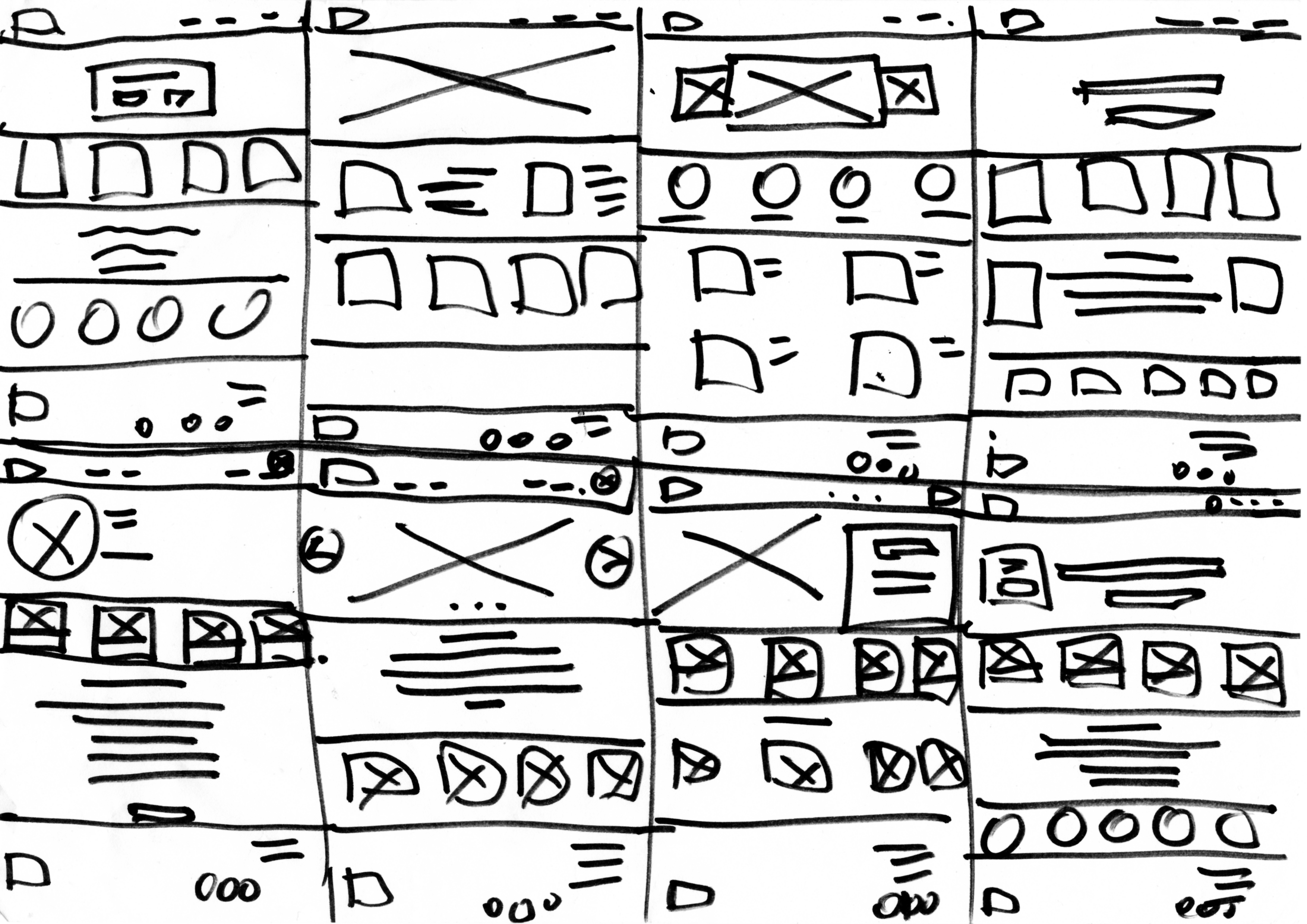

Image 1. corresponding to the Crazy 8s exercise for ideation


Our donation flow was designed to both educate users about the organisation’s mission and inspire them to take action, ultimately increasing donations and awareness. We created a streamlined journey with clear calls to action on the homepage, multiple conversion paths, and full user control over their contributions allowing them to choose what cause to support, how to donate, and how often they want to give.
.png)
After Information architecture analysis we could create a more intuitive solution for mobile phones, improving access to donate and adding the same style as the desktop format, making branding, layout and flow the same to avoid confusion in users.

Our solution for desktop user is focused on users who like to learn more of the organisations and theirs ethos, including older users that primarily use desktops to assess and do donate.


Increase
Call to action
Engagement
rate
Website visits
increase
Average navigation
time
The redesigned website has transformed how IJC connects with its audience. Here’s what we achieved:
- Simplified Donation Flow: The new interface reduces friction, resulting in faster, easier donations.
- Improved Engagement: Clearer branding and storytelling now resonate with users, driving deeper
connections.
- Increased Responsiveness: The site is optimized for all devices, ensuring a wider reach.
After conducting the research stage another meeting was held with the stakeholders, where we presented our findings and we agreed on the following.
- Create a responsive interface and easy to use when making donations.
- Information about the project should be displayed clearer.
- Branding should reflect more efficiently the organisation’s ethical values.
- Create a dynamic and intuitive donation flow.
- Provide users with the option to add their own amount of donation.
- The user interface requires improvements to help consolidate the social ethos of the brand.
This project was about so much more than building a website—it was about helping IJC make a real difference. By focusing on what users needed and staying true to IJC’s values, we’ve created a platform that’s built to last.
Moving forward, I’ll keep listening to feedback and tweaking things to make sure it stays fresh, inspiring, and effective. Together, we’ve built a digital space where generosity flows as easily as your morning coffee—and honestly, this is just the beginning. The best is yet to come!